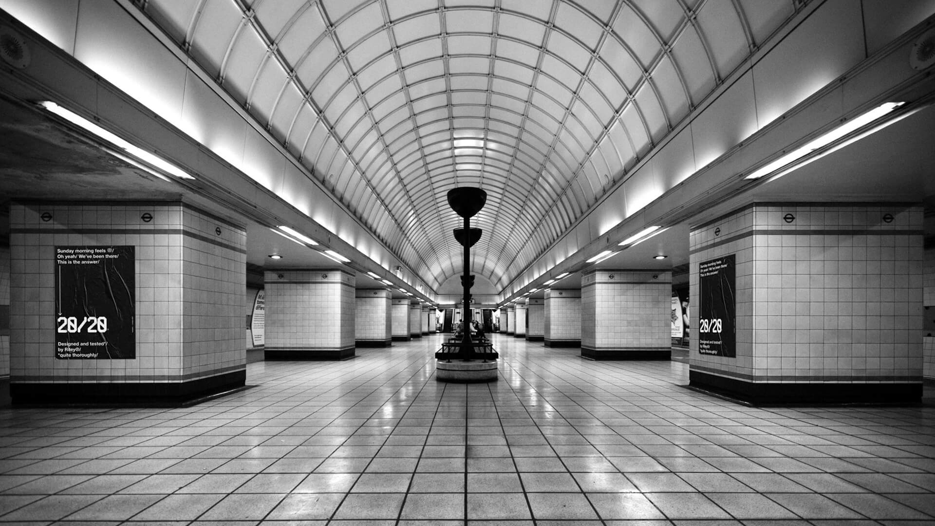
20/20 IS A CONCEPT BRAND FOUNDED BY TWO BROTHERS TOM AND JAMES RILEY.

Objective
Riley & Riley Ltd. created a drink that promises to prevent hangovers – it’s a mix of vitamins, rehydration salts, amino acids that break down toxins, caffeine and one secret ingredient. The company was founded by two brothers from Yorkshire – Tom and James Riley. They moved to London after graduating, set up their company and started manufacturing the drink. 
 
Solution
The name of the drink (20/20) is placed partially on the front and on the back of the bottle label. The more the user consumes the more visible the logo gets. When the amount reaches the lowest point, the logo gets clear; this subsequently means the user has absorbed all the required ingredients. Research shows the most important thing anyone should do to avoid next day's hangover is to rehydrate. That is the reason why 20/20 logo has been placed near the bottom rather than the middle or top of the bottle. The user is 'forced' to drink in order to rehydrate. Also, the bottle is made out of recycled, recyclable thinner than usual plastic that would prevent any accidents from happening when someone is a bit tipsy.
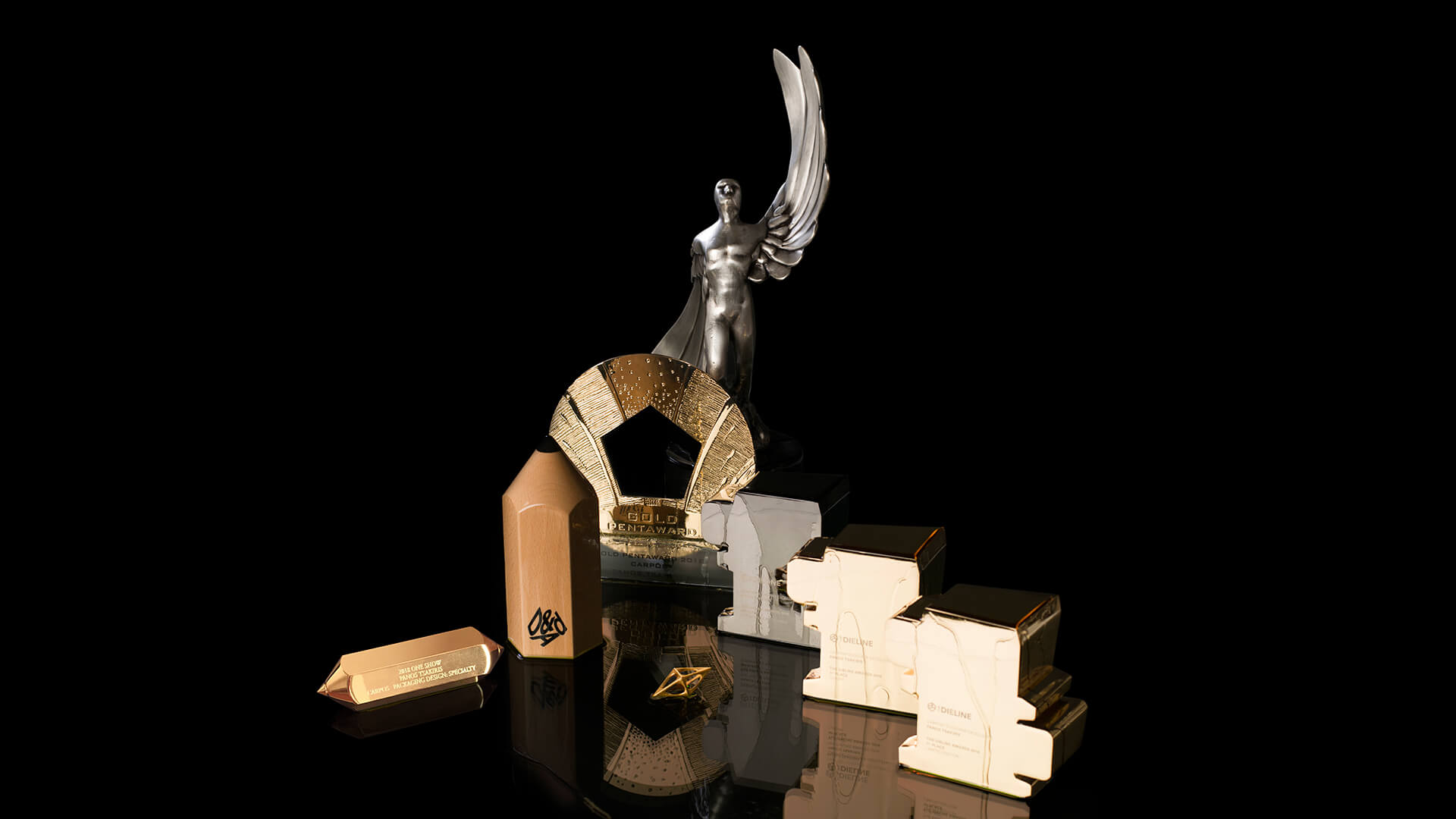
awards

A' Design Award, Gold

2018
pano design studio c/o panos tsakiris brand × packaging design for 20/20 concept packaging for riley brothers hangover preventive drink
‘Alcohol slows the pace of communication between neurotransmitters in the brain. The delay in communication between the brain and the eyes means that they are not able to function effectively which weakens the eye muscle coordination. This is what causes distorted or double vision.’
pano design studio c/o panos tsakiris brand × packaging design for 20/20 concept packaging for riley brothers hangover preventive drink
The main inspiration was the effect alcohol has on the brain and consequently the eyesight. The typeface and the system of design elements were created based on this very idea.
pano design studio c/o panos tsakiris brand × packaging design for 20/20 concept packaging for riley brothers hangover preventive drink
Research shows the most important thing anyone should do to avoid next day's hangover is to rehydrate. That is the reason why 20/20 logo has been placed near the bottom rather than the middle or top of the bottle. The user is 'forced' to drink in order to rehydrate.
pano design studio c/o panos tsakiris brand × packaging design for 20/20 concept packaging for riley brothers hangover preventive drink
pano-20/20
pano design studio c/o panos tsakiris brand × packaging design for 20/20 concept packaging for riley brothers hangover preventive drink
pano-20/20
pano design studio c/o panos tsakiris brand × packaging design for 20/20 concept packaging for riley brothers hangover preventive drink
twenty-twenty vision noun [U]
Perfect sight, especially as measured by a standard test: The optician told me I had twenty-twenty vision.
pano design studio c/o panos tsakiris brand × packaging design for 20/20 concept packaging for riley brothers hangover preventive drink
According to different studies all colours of the light spectrum -with the exception of one shade of green colour- aggravate migraine symptoms.
pano design studio c/o panos tsakiris brand × packaging design for 20/20 concept packaging for riley brothers hangover preventive drink
↑↑
creative direction: panos tsakiris
design: panos tsakiris
3d: christos panagos